Influence, illusion and ornament in Regency Style
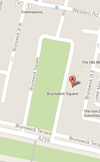
As we observe the many skills of making and maintaining buildings, it is important to be aware also of the spectacular, contrived architectural space that we are enclosed in, the great arena of Brunswick Square. It is the size and shape of some of the great urban spaces of the ancient world, like the ‘circus maximus’ in Rome. Such spaces were planned in Classical times for the intense activity and communal participation of physical sports and other displays.
The buildings around the Square form, therefore, a great theatre set, though that illusion of course, conceals the individual houses that make up the living community behind. In order to create the unity of external appearance the architect has chosen a ‘style’, that of the classical part, with its clear message of proportion and order. We all have to make choices about style on a daily basis, the cut and shape of our clothes or perhaps the fabrics in our houses, their colour and design, whether we want things matching, or in contrast to each other. Most importantly, we have to think about what those choices say about ourselves, what ‘message’ is put across.

Above: Different styles of columns.
In Brunswick Square, the classical style is arranged and selected to express grandeur and reflect the fact that people will walk around it and see it from different viewpoints. Along the sides of the Square, the giant half-columns (half because they appear to be buried in the wall surface) run through the first and second storeys to denote the most important rooms of the houses behind. They are topped with capitals in the Ionic order, with their familiar scrolling shape known as a volute.
But at the northern end of the Square on the return walls the half columns give way to pilasters (columns now square and flattened against the wall) with richer capitals known as Corinthian. If we walk out of the Square to the sea front we see why that decision was taken; standing with our backs to the sea front the north end walls echo the design of the terraces along the front itself. Care has been taken to create unity both from within the square and visually from outside it through modulations of style.
Choice about style to make sense of visual objects is a key decision in the work of people engaged in all kinds of craft skills. We like to think, rather romanticising the past, that styles sometimes spring naturally from the very labour of work, but history tells us that this is not usually the case.
In Regency and Early Victorian times, when Brunswick Town was built, pattern books were widespread, showing people at work how to use a sort of ‘language’ of style. These books originated in very expensively produced works for wealthy patrons, but increasingly were printed in cheap editions for a wider audience. Pattern books covered all architectural details (door frames, mouldings, skirtings and cornices, etc.) and also afforded a range of ornament suitable for domestic objects such as furniture, fireplaces and curtains.

Above: Different styles from Busby pattern book.
The choice of styles during the Regency was especially wide. The classical style was well-established as that of grand public buildings, something that continued down to the 20th century. The banks erected along Western Road in Brighton show how this style symbolising strength and security lived on. But Regency and early-Victorian England was aware too, of style choices from lost and non-European civilisations; Celtic, Moorish, and of course Indian and Chinese, the last two inspirations for the exterior and interior of the Royal Pavilion. At the same time, the British were curious about their own past and the style of medieval Gothic seemed to summarize a period of religious conformity.
In Brighton, we can see this style in Sir Charles Barry’s new Brighton parish church of St Peter’s, built in the 1820s near what was then the outskirts of town. These alternative styles were exhibited in a widening range of materials as British colonial power grew and delivered a broader range of luxury items to the domestic market.

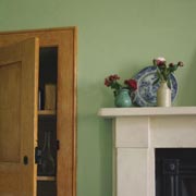
Above: Dining room column from 13 Brunswick Square.
So, looking for issues of style amongst the skills represented, we should be asking such things as: why change this way of decorating it? How far is the choice of style suitable for the practicality and scale of the subject? Will it match or contrast with other things that may surround it, or be attached to it? Curiosity about the reasons for a choice of style can make us more aware of our surroundings and sharpen our judgement about the decisions that have been made.
- Written by Dr. Maurice Howard, The University of Sussex


